Rejuvenating My Piece of the Interwebs May 22, 2015
This is something that I’ve wanted to do for a long time, and I was finally able to get my site redesigned and relaunched this week. The old design made it 5 years.
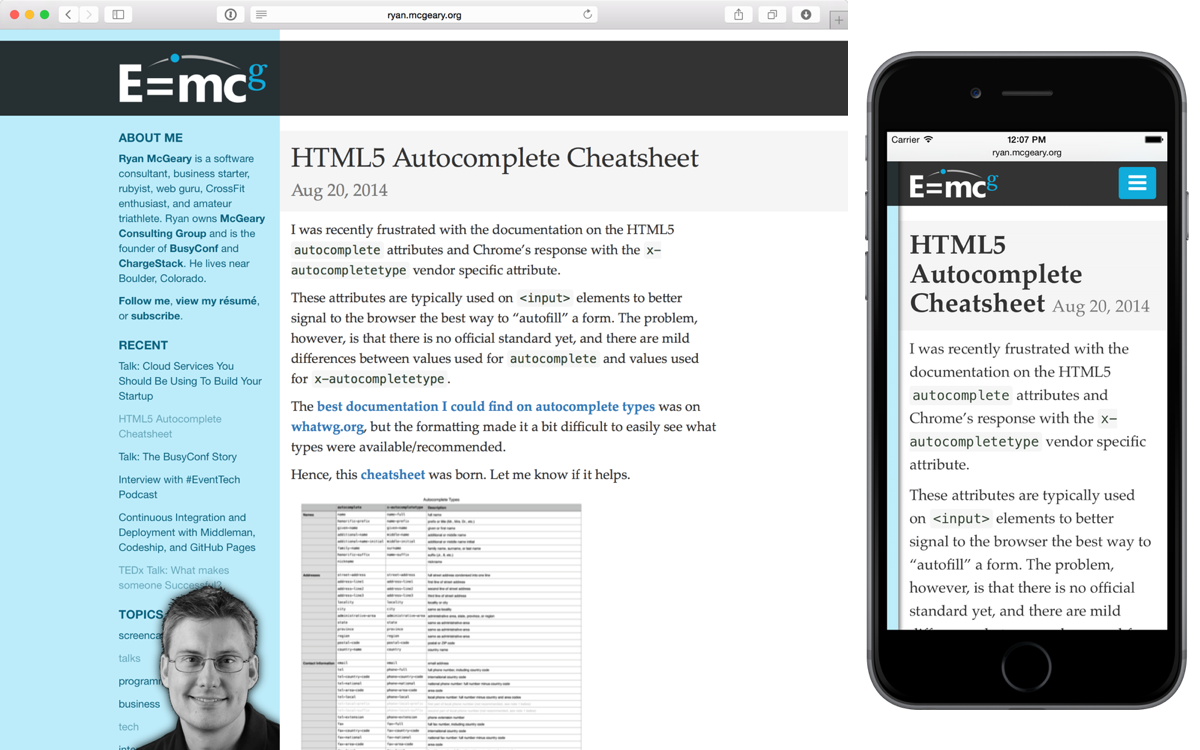
New, Responsive, and Light:

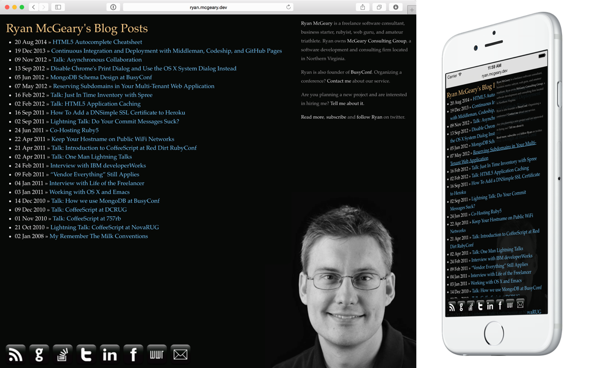
Old, Rigid, and Dark:

The old design served me well, but it had a few problems. For one, it didn’t work well on small mobile browsers. Now, it’s much more responsive to all browser sizes. I also used to get complaints about my big headshot in the bottom right corner. While that self-promotion-marketing-hack helped people recognize me at conferences and events, I think it freaked out some of the more scopophobic readers amongst us. My headshot-hack remains, but I now hide away when you start scrolling. For what it’s worth, my 3-year-old daughter thinks it’s fun to play peek-a-boo with it, so there’s that.
I think the new site design still needs some extra work, but it’s good enough to launch and start gathering feedback for now.
What Changed?
This was basically a total rewrite. A lot has changed, but here are some of the key updates:
- Responsiveness: Better views, font-sizes, and readability across all browser sizes.
- No More Comments: Yup, I dropped all my disqus comments. This might upset some, but it is going to make my life just a little bit better. Instead, I’ve enabled Twitter’s Web Intents at the bottom of each page. You can now reply to me via Twitter. For old posts, I did my best to find my original tweet about the post. For new posts, I’ll do my best to keep everything synchronized.
- Jekyll to Middleman: The original site was statically generated by Jekyll. Jekyll 2 made a lot of great improvements, and I’m sure Jekyll 3 will continue that trend, but Middleman has just always felt so much cleaner to me; it’s organized in a way that I like to work. Plus, it’s easier for me to standardize on one static site generator across the sites that I maintain, and I honed in on Middleman well before Jekyll v2 launched.
- Twitter Card and Open Graph Support: You know those nice catchy pictures you get when you share a website on social media? Yeah, I got that. Learn more about Twitter Cards and Open Graph.
What’s Next?
I have a lot of little plans for this site, including doing a better job of promoting the things that I work on day-to-day, but in general, I hope the redesign also rejuvenates my desire to publish new relevant content about programming, the web, business, entrepreneurship, tech, etc. No promises, but that’s the goal.
Let me know what you think. Enjoy!
Please share, reply to comment, or retweet. Also follow me for more.
Tweet Follow @rmm5t